
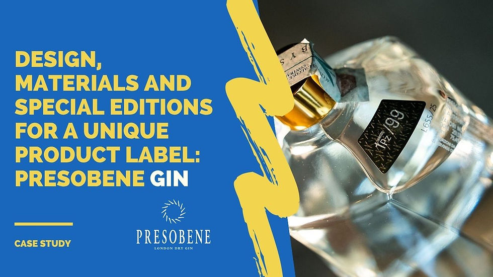
Restyling of Galbani's Salami line
- Alkam

- Jan 18, 2024
- 1 min read
Updated: Jan 20, 2025

Products in the food sector often require a graphic update of the defined packaging restyling. And' necessary for several reasons: line extensions, logo update, product update or searching for a different price positioning strong>.
Today we show you an example of a packaging restyling that we printed for Galbani:

The graphic renewal gives particular emphasis to the connotation of salami to facilitate the choice in the refrigerated counter, with the various different variants (Rustico, Napoli, etc....) replacing the name of the line.
The general style, more current and cleaner, aims to increase the qualitative perception of the product.
Technical aspects of printing
In particular, the use of gold metallic ink was introduced to embellish the packaging and convey the value of the product, maintaining the now iconic "green tablecloth" in the background to give continuity to the line of cured meats.
From a technical point of view, the label is printed on coated paper with PET support to better meet the technical needs of the application.


Comments