
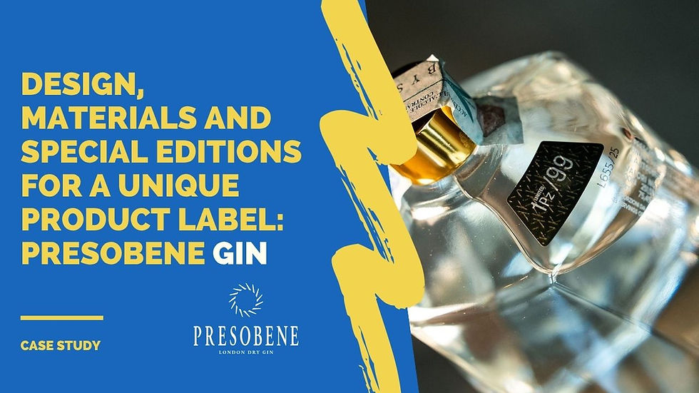
Labels for Presobene Gin: design, materials, and special editions for a unique product
- Alkam

- Jul 30, 2025
- 3 min read
Index
Introduction
Bruno Presezzi Prima Srl: the company
The customer's requirements
The project:
Materials used
Design and functionality
Printing challenges faced
Conclusions
Introduction
In the world of artisanal products and limited editions, packaging—and labels in particular—play a fundamental role in communicating the identity of the product and enhancing its perceived value. This is the case with Presobene Gin, created by Bruno Presezzi Prima S.r.l., which chose Alkam as its partner to design a technical, elegant, and distinctive label.
Bruno Presezzi Prima Srl: l’azienda
Bruno Presezzi Prima S.r.l. is a company based in Burago di Molgora (MB), operating since 2019 and specialising in the import-export of meat and food commodities. It was founded with the aim of extending the Presezzi brand to the food & beverage sector, distinguishing itself for its high-quality approach and participation in important international trade fairs such as Cibus, SIAL, FHC China, and Anuga.
Although it is part of the group founded by the historic mechanical engineering company Bruno Presezzi S.p.A., “Prima” represents a new entrepreneurial direction focused on the food sector. The launch of Gin Presobene is a concrete example of this vision, combining industrial spirit, refined design, and limited edition.
Customer requirements
For the official launch of their gin, the company needed:
Limited edition numbered labels (499 limited edition bottles out of a total of 50,000 bottles produced);
a design that visually evoked the technical and mechanical world of Bruno Presezzi;
high-quality finishes and moisture-resistant materials for the bottles, in line with the quality of the product;
special labels for collaborations, such as the one with Koderle, a luxury suite in Brunico.
The project
Materials used
For the launch event, the labels were made of silver PP, digitally printed to simulate foil, perfectly matching the colors of the bottles' distinctive caps. The plastic material was also chosen for its durability and shine.
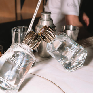
Two labels were created for the project with Koderle:
One version was made from an innovative cherry wood material, Avery Dennison's Fasson Cherry Wood, screen printed in black and applied to the outside of the gift box for guests of the suite itself;
a second version in silver PP with the Koderle logo in the background and the words “LIMITED 1 Pz/99” digitally printed to highlight the exclusivity of the edition.


Design and functionality
The visual identity of the project was built on technical, elegant, and recognizable elements:
the labels on the limited edition bottles for the event featured turbines in section screen-printed with glossy relief paint;
the contrast between gold and platinum enhanced the premium effect;
each bottle was individually numbered to emphasize the exclusivity of the edition;
the Koderle labels, on the other hand, were designed to reinforce the link with luxury hospitality, thanks to the use of natural wood and a simple yet refined design.
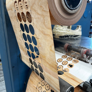
Printing challenges
Among the main challenges faced:
Making a technical pattern (the turbines) aesthetically harmonious without sacrificing legibility;
sequential numbering on a limited print run;
printing on wood, a noble but complex material that requires attention to color rendering and ink adhesion;
managing different materials (silver PP, wood) with different printing and finishing technologies.


Conclusions
The Presobene project is a perfect synthesis of technique and creativity. An exclusive product, created by a company that aims to tell a new and elegant story.
Thanks to technical advice and the ability to manage materials in relation to the complexity of the product, we have been able to create labels that not only enhance the product, but also tell its story visually, highlighting its identity and limited edition status.
Would you like to create a label that makes your product truly unique?


Comments