Unifying the product through labeling: MeMento Case Study
- Alkam

- Jan 18, 2024
- 2 min read
Updated: Jan 20, 2025

Today we're talking to you about this project related to labels for Beverage sector, specifically in the Spirits branch.
A sector in constant expansion, but at the same time highly competitive: let's go into detail about the type of customer, the development of the project and finally the result we obtained.
The customer
MeMento is an innovative start-up born from the idea ofEugenio Muraro, who, through reading an ancient Florentine recipe book, glimpsed the potential of transforming ancient remedies into contemporary natural pleasures .
Then the non-alcoholic distillate was born, obtained from a mix of aromatic waters with the scents of the Mediterranean, hence the name Memento",, a "memory". of the perfumes and flavors of the Mediterranean bottled and always at hand.
An innovative solution that can be used as a base for cocktails thus allowing consumers, among whom a health culture is increasingly spreading, to avoid alcoholic drinks without giving up the pleasure of drinking in company .
With its unmistakable aroma it becomes a versatile base for creating cocktails.
Discover areas of technical and economic improvement of your labels now with Labeling Check
The project
In the world of Wine & Spirits, labels represent a fundamental marketing asset.
In fact, in addition to the information function, they play a central role in the perception of the value of the product and in fostering choice< /strong> on shelf.
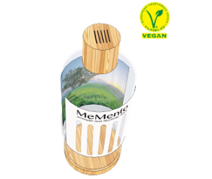
Specifically, the Memento label was created with FSC® Felt Marked Paper.
The process to achieve this result was very complex: the use of quality materials, the management of the printing and the die-cutting to create the "stripes" were all choices suggested and studied with the customer to getting to dress the product, giving it the right uniqueness, for an innovative and very high quality product.
Using a particular technique, we also customized the inside of the label, also printing on the internal adhesive side.
With this technical solution from the "stripes" on the front you can see the colored background< /strong> which represents an iconic Mediterranean landscape through the transparent contents of the bottle.
This vision obtained with the right graphic design serves to strengthen the natural values transmitted by the product< /strong> with a one-of-a-kind design.
The result is below, what do you think?


Comments